Introducing Urban Atlas Nepal: Ward-Level Flood Hazard for Kathmandu Valley

Today we’re releasing the first version of Urban Atlas Nepal, an open data and methodology layer for understanding urban risk in Nepal’s cities, along with its first application, SmartHousing Nepal. SmartHousing starts with a simple question that many people in Kathmandu Valley face with very little information: how safe is the neighbourhood I’m about to move into?
SmartHousing Nepal was built as one of the 10 winning solutions of Habitat Youth Solutions 2025, a youth-led housing innovation grant from Habitat for Humanity. It is still experimental, and we are refining it as people use it.
You can explore it now at atlas.oknp.org.
Why we’re building this
Research on flood hazard, earthquake hazard, and air quality in Nepal’s cities already exists. The problem is where it lives: in reports, agency portals, and academic papers, in formats that rarely reach the people making everyday decisions about where to live, build, or invest.
Students and young migrant workers moving within Kathmandu Valley usually choose a room based on rent, distance, and word of mouth. Climate and safety risk is almost never part of that decision, not because people don’t care, but because the information isn’t visible where the decision is made.
Urban Atlas Nepal brings that research down to where people live: the ward, the municipality, the district. SmartHousing Nepal is the first place we’re putting it to use.
What’s live today
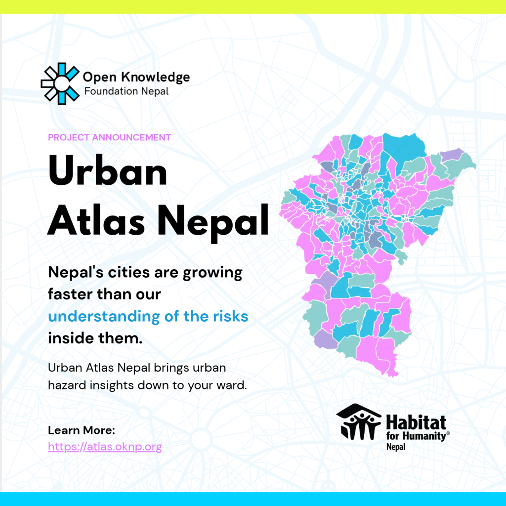
SmartHousing Nepal is a map of every ward in Kathmandu, Lalitpur, and Bhaktapur districts. Click a ward, and you get a plain-language summary, not a raw score.
- Flood hazard, ward by ward: Each ward is rated from very low to very high, with a short explanation of what that level means.
- Live air quality: Readings from World Air Quality Index stations across the valley, refreshed every 30 minutes.
- A housing report for each ward: Residents and households, overall housing quality, and the share of outer walls and foundations built from non-durable materials, drawn from the 2021 National Population and Housing Census.
- A model you can adjust: The flood model’s weights are open on the map, and you can change them yourself.
How the flood model works
The flood layer is indicator-based. It is not a flood simulation, and we want to be clear about that from the start.
It combines six environmental indicators, each scored into five hazard zones and weighted into a single flood hazard index:
- Rainfall (25%), from Open-Meteo reanalysis data.
- Distance from major rivers (20%), from OpenStreetMap river networks.
- Slope (20%) and elevation (15%), from the Copernicus digital elevation model.
- Land use and land cover (10%), from ESA WorldCover.
- Soil type (10%), from ISRIC SoilGrids.
This follows the weighted-overlay method common in GIS flood susceptibility research, including studies of Kathmandu Valley. A ward’s level is read from the model at the ward’s geographic centre.
Because the right weighting is a fair question to argue about, we made it adjustable. In the map’s Flood panel, you can move any indicator’s weight and watch every ward recompute live, then reset to the published defaults. If you think rainfall matters more than soil type in your area, you can see what that changes.
What this data is, and isn’t
These are modeled estimates for general awareness, not official hazard assessments. They are ward-level approximations built from environmental layers, not measurements taken at every point, and a ward’s flood level depends on the weights in use. Air quality is only as precise as the nearest station, and wards more than 4 km from an active station show no data rather than a guess.
Earthquake hazard is paused on the map for now. We built an earthquake layer from fault proximity, historical earthquake density, geology, and soil amplification, and we’re refining it before we show it again.
For anything involving safety, construction, or money, check with local authorities. We’d rather say this plainly than have the map read as more certain than it is. The full methodology, including data sources, is on the methodology page.
What comes next
This is a first version, and we expect it to change as people use it.
- More layers for Kathmandu Valley, starting with the return of earthquake hazard, and more as reliable data becomes available.
- Better data, ward by ward, through municipal partnerships, new surveys, and research collaborations.
- New applications and cities built on the same atlas, one at a time, where there’s real demand.
Work with us
We’re especially keen to hear from:
- Municipal planners and government agencies with local risk or infrastructure data.
- Researchers and academics working on urban risk in Nepal.
- NGOs and development partners working on related civic data.
- Anyone who finds an error or gap in a ward’s data.
Explore the map at atlas.oknp.org, read the methodology, and write to us at info@oknp.org.